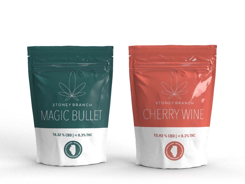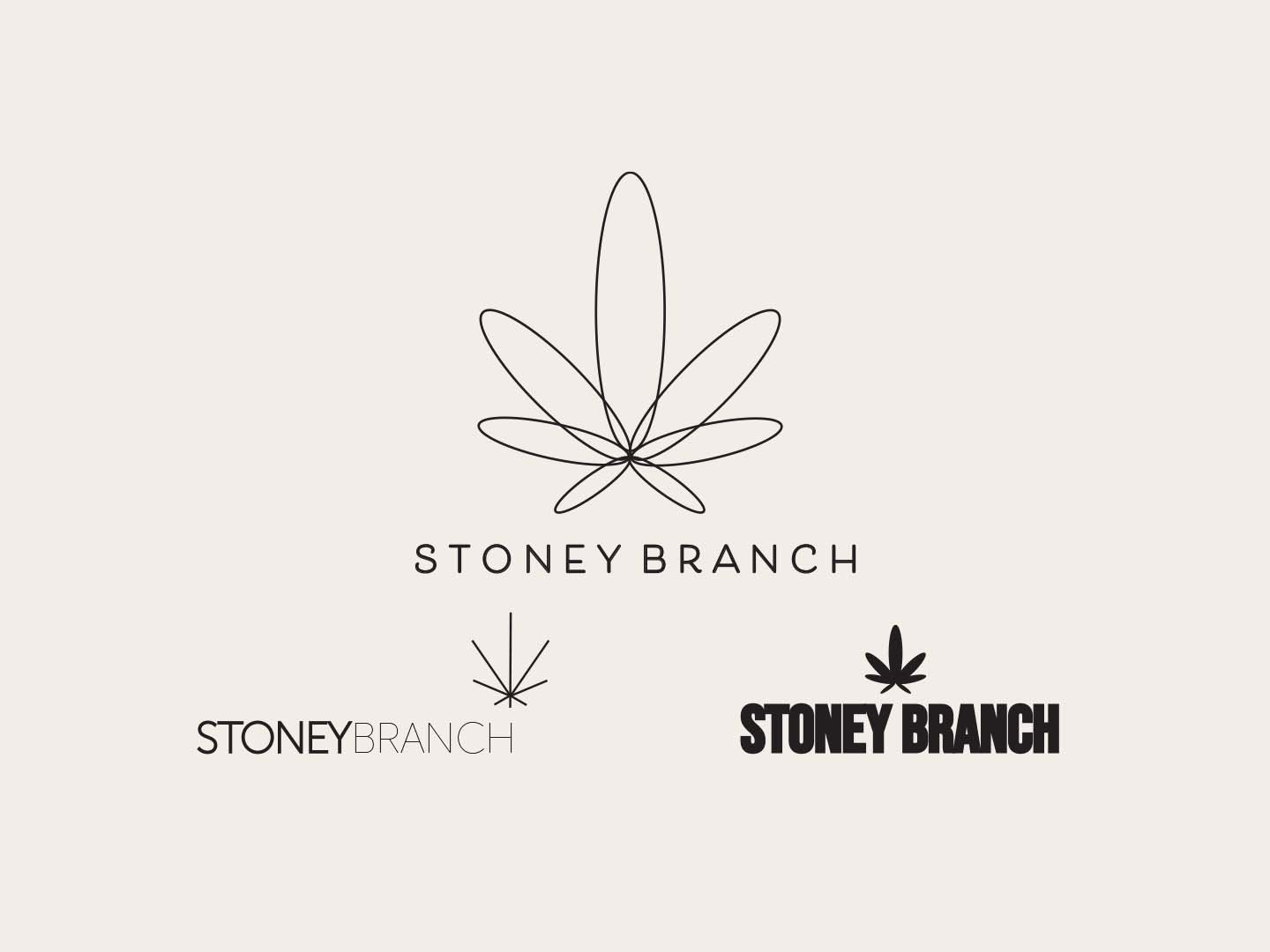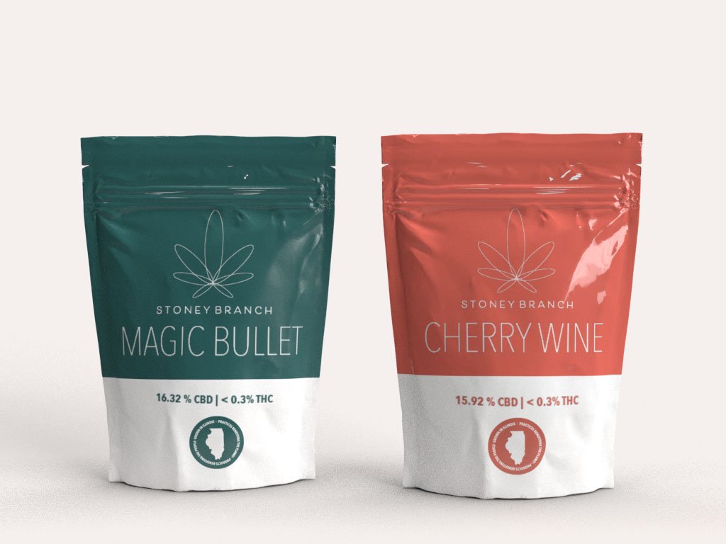
This project is a rebrand for Stoney Branch CBD. The assignment was to redo a logo for a brand that I believed had much more potential. I wanted to take Stoney Branch’s packaging from looking very family oriented, and homely, and make it more appealing to a younger active audience..
Since many look at CBD as a step towards wellness, the idea was to come up with a logo that resonated with holistic “methods”. The updated packaging colors and contents remain consistent with the colors and strains that Stoney Branch uses today
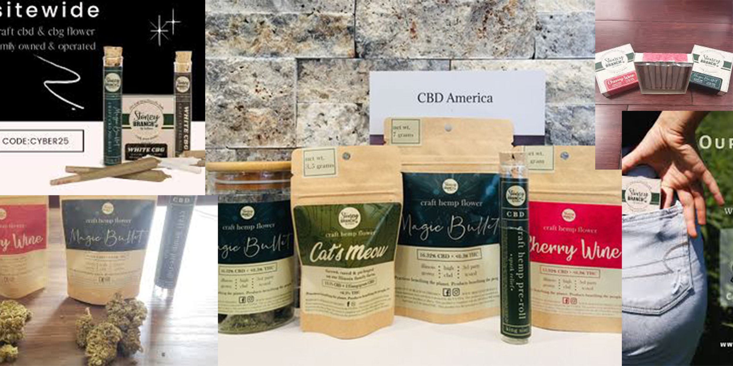
To start the project, I take a look at their current packaging, as well as the new target audience


