Increasing Conversion: An Update to Noirci’s Landing Page
At a glance: Noirci had a landing page that had an 84% bounce rate, but after making some changes I was able to design a landing page that brought this down to 56%
My Role: Conduct a usability test, analyze Noirci’s data, and find out why everyone is bouncing
The Problem: Noirci’s landing page had an 84% bounce rate, but we want to help users leave with a few more successful interactions
Getting to know the user
To better understand the audience, we reached out to people who follow Noirci on Instagram, but have never visited their website. This was a great way to test users who are most likely to use this particular product while looking at it with a fresh set of eyes.
Once the audience was selected, we began a series of remote moderated usability studies using Zoom to keep track of the user’s interaction with the site, and to directly take note of their expectations.
User Empathy
Key Takeaways
Noirci’s original homepage lacked an information architecture. All of the products were in a single shop page which led the user to too many options, not enough organization, and no real funneling
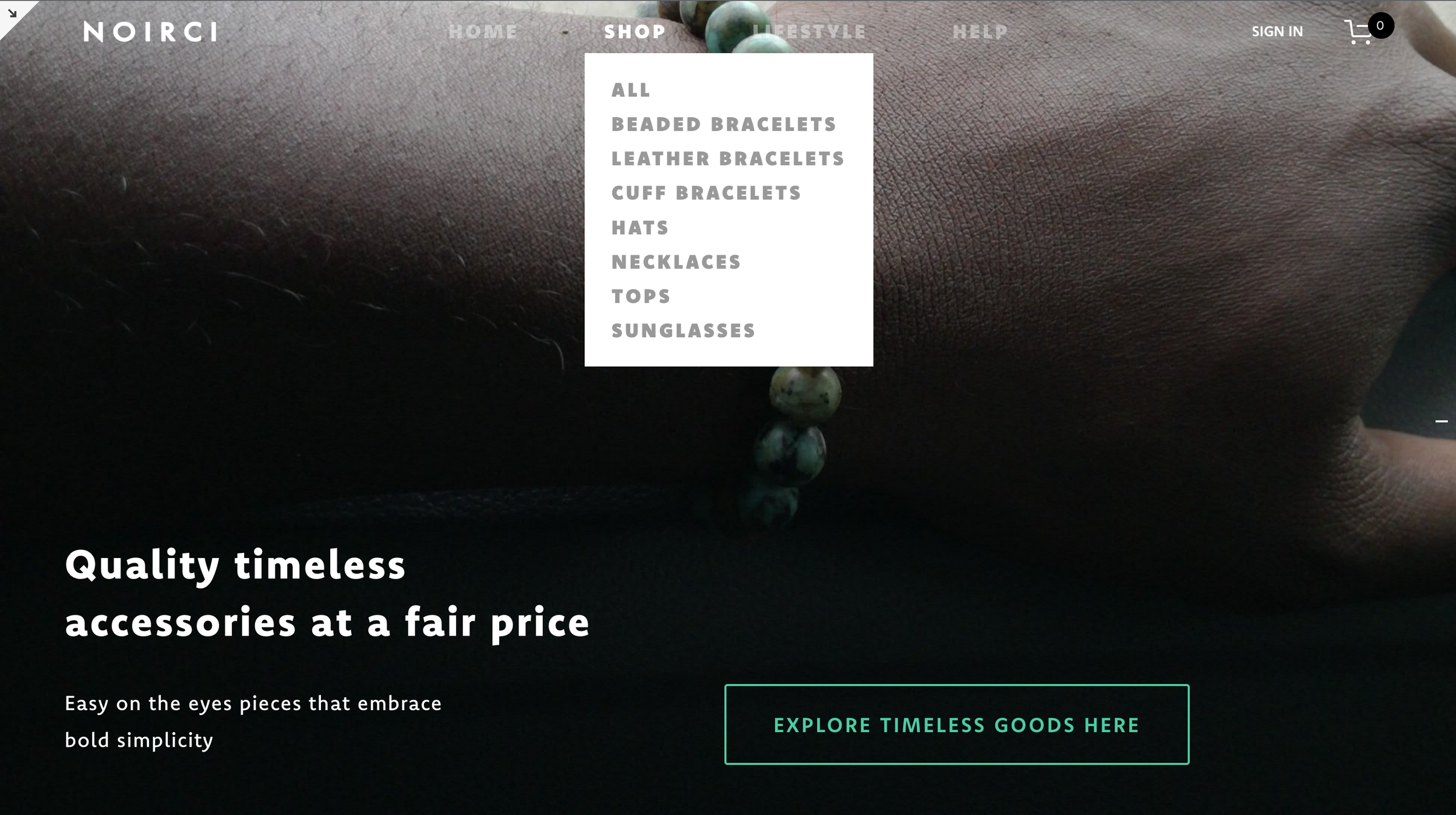
Possibly the most glaring issue on the landing was the lack of accessibility of it. The hero image had text that ended up blending the site’s main navigation menu, and headline
Insights Into Action
Information Architecture
Because users anticipated a drop down menu, the first thing we did was organize and categorize Noirci’s offerings into an information architecture
Why?
Organization will help better funnel users to where they want to go instead of giving up and leaving the website disappointed
Next, lets clean up this homepage
Design Iterations
There were a handful of elements we wanted to make sure were included in the landing page. Since visibility was the biggest concern we wanted to have a hero image that contrasted text. We also wanted to try having a button on the right hand side to let users know there would be more information past the fold.
One of the biggest constraints was that Noirci’s website is designed on Squarespace version 7.0. This meant that customization would be an issue, and anything out of the drag and drop insert here world would likely not happen. Features like “hold position on scroll” were non existent in 7.0 so that meant our scroll button was a no go.
Since we could not use the scroll button, the best solution was to have a single paged landing page with a large call to action button. The only content beneath the fold would be editorial, and contact information. This works because it reduced the amount of noise the audience would receive.


