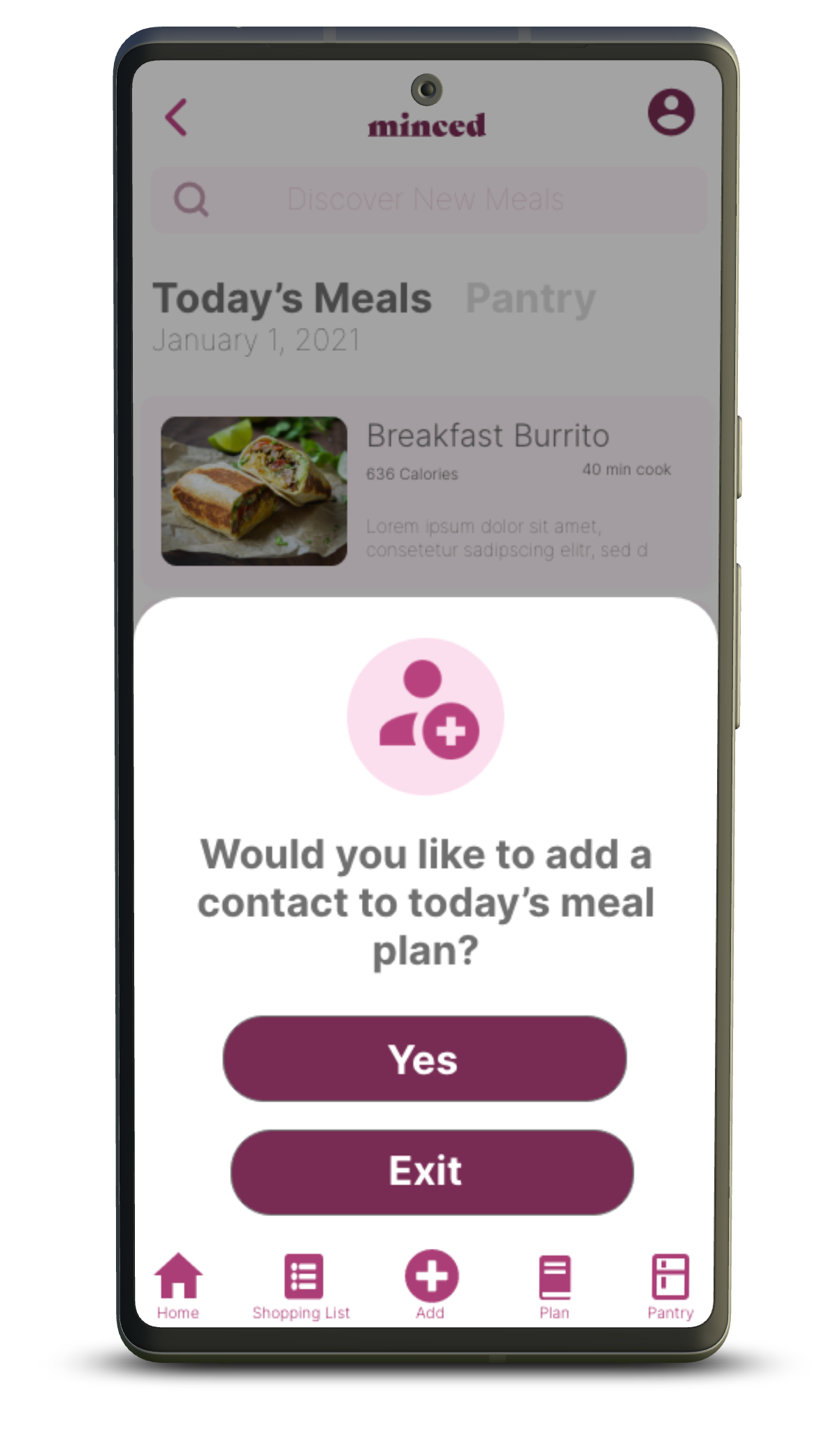
Minced Mobile App
Project Duration
1 month
What is it?
Minced mobile is a meal planning app that makes prepping and planning fun. As Minced says “Meals prepped better together”. Life can get hectic, so invite friends and family along the way!
The Problem
Most people want to plan their meals ahead of time so they can save money by avoiding eating out all of the time. Unfortunately most become overwhelmed by the many tasks that come with prepping and planning meals
The Goal
The aim is to make meal planning a little easier by allowing you to prep and plan with your family or friends. This project also aims to include other features to keep users as organized as possible.
My Role
UX Design
Responsibilities
For this project my responsibilities were to conduct user research, wireframing, prototyping, and user interface
User Empathy | Getting to know the user
For this project I wanted to better understand what keeps society from prepping their meals ahead of time. Research started with a brief questionnaire to find the pace of life the average user has, and how that impacts their chances of planning their meals. Initially my belief was that most just preferred fast food, and avoiding cooking altogether. To my surprise the number one issue for most users was feeling too overwhelmed to cook, and a lack of support from significant others.
The Pain Points
“Some meals are just too complicated"
Some users have a hard time with meals that either have too many steps, or too many ingredients. With this information we will be sure to include a pantry for items that users already have at home, and a shopping list so both will work together. With these tools you’ll only shop for what you need.
“I want to cook, but my partner doesn’t seem interested”
To make sure users work together, our main user flow will be the option to add a friend to one or more of your meal plans. In theory this will help users stay motivated, while giving a little push for a family and friends to join in.
User Persona: Justin
Justin’s Journey
Meaning…
Throughout Justin’s journey there are quite a few tasks on each list. From organizing grocery lists to gaining inspiration for meals, there are a few points where Justin can potentially fall off of his journey. Hopefully organized grocery lists, and collaboration can help minimize these risks.
Starting the Design
The first goal for this project was to make a home screen that would be informative, and straight to the point. Being that the main feature of Minced is the ability to add friends and family to a collaborative meal, we wanted to make sure a plus sign was on the page and noticeable. The less friction for the user, the better.
Fine tuning the design
After the Usability Study
After the low fidelity prototype was finished, we decided to head out and conduct a moderated usability study. Our main goal was to find out where users may encounter some friction while attempting to complete their tasks. Our main areas in question were during the sign-up process, adding a friend to your meal plan, and viewing the user profile. Throughout these processes users provided us with a few findings:
A lack of sign up confirmation left users unsure of a successful sign up, letting us know that users need a sign up confirmation page
Participants were unsure of the plus sign’s function in the app, informing us that an alternative more direct “add friends” feature is needed for a more straightforward call to action.
Users had issues with their back button, showing us that a redesigned back button would better suit users.
Insights applied
A lack of sign up confirmation left users unsure of a successful sign up, letting us know that users need some sort of sign up confirmation
Users experienced a bit of confusion when they were tasked with adding a friend to their meal plan. We added the word “Add” to the plus sign for a more direct call to action. Eventually we want this button to also be a way to add meals to the day, and maybe even for long term planning.
In conclusion…
This project has shown me that certain design elements are not as known as I thought. From Add buttons to plus signs we can never assume we know what’s best for the user, or what they understand
The new design iterations will help people remain on task. Relevant updates and features continue to roll-out as more data and information is collected


